Balfour Pacific - 3003 North Central Renovation
A comprehensive refresh to a 1960s office tower boosts occupancy and restores the building's original design integrity.
Client
Balfour Pacific
Location
Phoenix, Arizona
Markets/Services
Architecture, Commercial Office Buildings, Interiors, Landscape Architecture, Corporate & Commercial
Size
7,500 GSF
The 26-story Phoenix Corporate Tower has been part of the Phoenix skyline for decades, designed in the midcentury international style and home to several prominent tenants over the years. When client Balfour Pacific purchased the building, however, various eras of partial renovations had left it dated and disjointed, and its occupancy rate hovered around 66 percent. Balfour wanted to refresh and rebrand the space to upgrade its image and boost its occupancy.
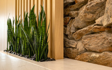
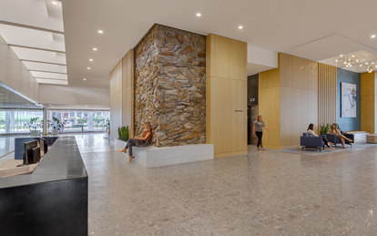
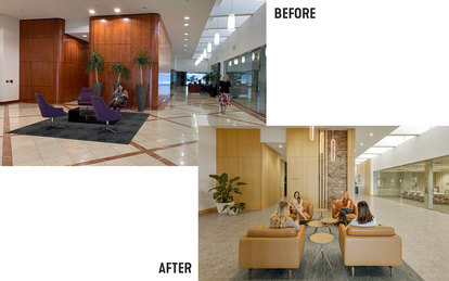
The remodel peels back the layers of earlier updates made to the 7,500-square-foot lobby to create the building's new jewel: an activated, contemporary space for a 21st-century market, yet evocative of the building's stylish original design.
The remodel takes cues from historic photos and mid-century graphic styles for the interior finishes, wayfinding graphics and exterior modifications. As a result of the update, occupancy rose to more than 90 percent.
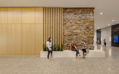
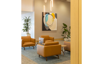
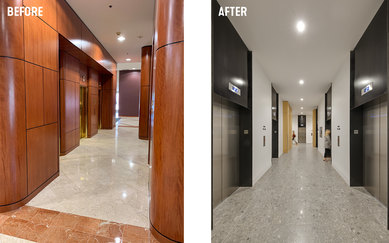
The strong architecture of the 1965 building guided the overall design concept. The project focused on a complete, holistic remodel that would emphasize its clear, sharp lines and enable users to interact more naturally with the architecture. Mechanicals were left largely intact. Old photos hinted at original flagstone walls, which the team revealed by removing the heavy and dated cherrywood paneling. To keep the flagstone from overwhelming the design, it was exposed in gradients: The meeting of two flagstone walls becomes a focal point, while other sections are slightly obscured by slatted light-wood panels of reconstituted oak. Sleek terrazzo-like flooring replaces the ornate '80s-era marble. Midcentury modern-style furnishings, lighting and other finishes were also streamlined with a clean, simple palette of materials and color.
Prior to the interior renovations, SmithGroup partnered with Small Giants on rebranding the building. The shortened name emphasizes its premiere location in Midtown Phoenix, adjacent to a light rail station and another major redevelopment that includes a new medical school campus.
Lively 1960s colors, fonts and textures establish a stronger exterior presence to build the brand and give prominence to wayfinding—especially important for the site, which had multiple entrances and a long underground tunnel.
The planned exterior treatment creates a sense of arrival, with bold signage at each access point, a prominent overhang to emphasize the main entrance, a lawn area for events, and planters to add color and texture. Better lighting, paint and flooring brighten the tunnel, enlivened with a linear mural of photos and newspaper clippings that depict the building's history and its resurgence as a premier Phoenix address.
